
As April 3rd, the day of my departure for Germany, comes ever closer, I find myself with more administrative tasks to complete, and subsequently woefully less time to write. Throughout my time in the Museum Studies program at George Washington University I have had ample opportunity to explore the topic of digital museums. This week, I thought I would share my insights on museum web design and content development.
Below is my recent critique of the Philadelphia Museum of Art’s website. Although the exhibitions and events on the site have been updated since my academic exploration, its basic structure and design remain the same, allowing my critique to remain relevant.
I would love to start a discussion about any of the web design topics I touch on in this paper. Please feel free to comment with your thoughts.
The Philadelphia Museum of Art is landmark cultural institution in the heart of Philadelphia, Pennsylvania. It boasts an iconic building and a vast collection of approximately 240,000 objects, which it has amassed over the last 142 years. In this critique, I will examine the site from a critical perspective as a user, analyzing its strengths and weaknesses from the point of view of an individual concerned with user-centered digital experiences.
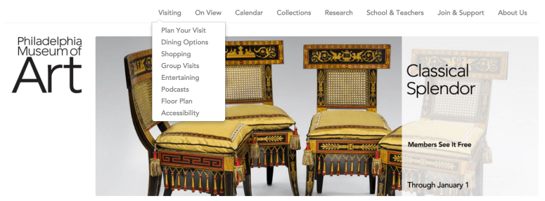
My first impressions of the site are complex. I immediately appreciate the fact that the current exhibitions are given front-and-center placement in the changing slider panel just below the main menu. However, the organization of the site is not altogether clear at first glance. The exhibitions are not categorized as such with a unifying heading (as seen in the screenshot below), and therefore it is not obvious to a first-time museum-goer exactly what the first panel is attempting to communicate until each slide has played once or twice. Additionally, I take issue with the functionality of the main menu. After hovering my cursor over each menu item several times and failing to receive the expected dropdown menus, it became clear to me that the dropdowns do not descend as a result of a cursor hover, but must in fact each be clicked on order to be revealed. The resulting dropdown menu seen below was obtained only by clicking:
The footer panels across the bottom of the homepage (as seen at the bottom of the screenshot below) share a great deal of important information about the museum, such as current events, visit planning information, a text-based list of current exhibitions on view, and an explicit mention of the museum’s collection. A curious feature of the site is the fact that in terms of scrolling, the user experience is extremely shallow – i.e., brief; the below image is representative of the entire homepage. This feature certainly allows swift access to the helpful and informative footers, but at the same time, I feel that the homepage has potential for richer and more extensive content than it currently contains.

At the same time, while I would prefer for the homepage of a museum to contain a larger volume of easily accessible portals to deeper destinations in its interior, the footer panels achieve the goals I feel a museum website should achieve at first glance: it shares information about how to access its collections and exhibitions, both online and in person. One benefit of condensing the entire homepage’s content into the space allotted by the browser window is increased ease of access to the all the homepage’s available portholes in one glance. Users who are less comfortable with websites may find comfort in the fact that they are able to click through to the area of the site in which they are most interested without needing to scroll. The design of the homepage is therefore not innovative or necessarily pleasing, but it is convenient.
The site’s overall design is similarly simple, employing a uniformly white background color, primary sans serif text in black, and emphasized text in red or bold black. There are benefits to a site with so few frills: on one hand, it is extremely intuitive in terms of readability. On the other, it is almost forgettable in its simplicity. There is no discernible style that links it to a particular feature of its mission statement or a particularly prominent portion of its collection. It is neutral, and due largely to this neutrality it is mediocre from a style perspective.
The purpose of the Philadelphia Museum of Art’s website, as I feel is made evident from a short glance at the homepage, is to reflect the institution’s role as a world-famous destination for researchers and art lovers seeking to explore its collection. The most notable features of the homepage are the large images of items in the current and permanent exhibitions that delineate various pathways into the deeper layers of the site. Even the museum’s logo has been converted into an animation during which the ‘A’ in Art is transformed into several different collections items of similar shape to the letter before re-emerging as the letter A once again (see the logo development image below). The message is clear – our objects are our star.

The ‘Visiting’ menu indicates that the museum intends to target a specific audience with their site (see image at right). Items include options for enjoying a meal at the museum, information about purchasing museum merchandise, and podcasts such as tours of the permanent collection and episodes on many of the most recent and current exhibitions. There is a sidebar option accessible on most of the site’s pages that allows for the purchase of museum admission advance online (see image below, left). The users who would most benefit from exploring these menu items are people who are planning to enhance their visiting experience by taking advantage of the museum’s various options for making it more thematic and personalized.
 The target audience of the website seems, therefore, to be users interested in visiting the museum in person, with an emphasis on returning visitors, as well as those seeking to explore the collection online. Another indication of the website’s target audience is the heavy emphasis on museum membership. A sidebar widget linking to the museum membership page is visible on every page of the website (see image below left). In addition, there is an entire series of events solely accessible to museum members.
 After the initial confusion of the main menu’s functionality has been alleviated, navigating the site from the homepage inward is fairly intuitive. The main menu bar remains visible no matter which page a user visits in their journey further into the site. The website is organized through the use of categories that make sense to me as a user, such as ‘Calendar’ and ‘Collections,’ and maintains a consistency of accessibility to other site pages throughout. The menus and the site’s organization are further highlighted through the use of a redundant menu side panel. Once a user has navigated to an inner page, the side panel displays the entire menu from which that inner page was selected, as well as options for returning to the homepage, for ease of navigation (see below).

In addition to the always-accessible main menu, many of the inner pages offer submenus that provide additional helpful information based on your level of interest in the information on each page. As seen in the example above, teachers who are interested in planning a class visit may go only as far as Arranging Your Visit before calling the museum to schedule a field trip. They may also, however, navigate to the submenu tab entitled School Visit Request, where they may fill in all the necessary information to schedule a class trip for their students online, rather than over the phone.
Users are also encouraged to ‘learn more’ or ‘read more’ through the use of a feature across the site that, rather than navigating away from the current webpage, drops down additional paragraphs of information on the subject matter in which users expressed interest by clicking on the button. I think this feature is wonderful for ease of navigation, and makes excellent use of the site’s simple and user-friendly organization by keeping all the relevant information on one page (see images below).


The content across the site is consistent and easy to read. That consistency, however, does not extend to the intuitive discovery of some of the site’s most important content. The site has a search function, for example, but the only access point is in very small print in the footer menu (see image below). For users who are accustomed to navigating a website using internal site search, the fact that this feature is so well-hidden could be a barrier to access and further browsing.

The museum’s mission is also somewhat hidden. Based on my exploration of the site, my best guess is that the mission statement takes up the first paragraph of the Our Story page. According to the Philadelphia Museum of Art’s mission, it aims to be a place that welcomes every visitor with open arms in hopes that the art will inspire them. Unfortunately, without combing through several menu options first, I may never have found it. My chosen pathway was: Home > About Us > Our Story (fourth item down).
Despite these potential barriers to the access of important content, one thing this website does succeed at is extending the institutional mission across its digital home by providing a rich and multidimensional exploration of its collection online, which I feel is its strongest feature. Thus far, the museum has digitized roughly half of its objects for public browsing, and indicates that the digitization of its collection is an ongoing project. The online collections database can be explored in various ways that appeal to different groups of stakeholders. You can browse the collection by artist, type or classification of art, origin, or through various themes based on the curatorial department under whose jurisdiction the object falls. Alphabetical order is also a quick-browse option (see image below).
 The site is mobile responsive, and in my opinion, a more engaging experience when browsing on a mobile device, as the menus are spaced more closely together for easier at-a-glance viewing.
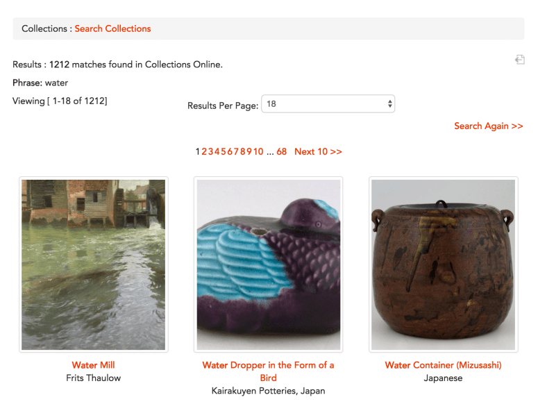
Most notable, however, is the ability for users to search the collection through the use of keywords. This search feature allows for an incredibly organic and personalized experience of the museum’s objects based on individual preferences and interests. I tested several keywords and was pleased with and intrigued by my results. If, for example, I searched for objects related to the keyword ‘water,’ I received a collection of objects somehow connected to the keyword ‘water’ which sparked further desire for exploration:
Users also have the ability to combine search options and create an advanced search using several search protocols and settings. Combining a keyword search for ‘water’ with a specification that items be assigned to the Costume & Textiles department yielded a fascinating collection of objects that could have led me down several delightful rabbit holes of casual research:

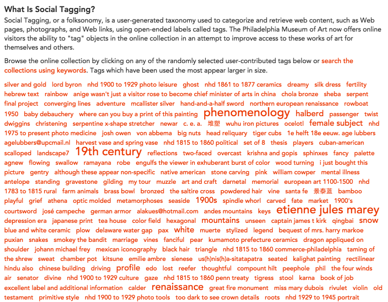
The online collection also allows for user-generated metadata in the form of what the museum calls social tagging. This wonderful feature, whose landing page has a randomly generated wordcloud (see below), allows user control and ownership over their web browsing experience as they work their way through the part of the collection that interests them the most, assigning the appropriate tags to each object as they see fit. It also allows for diverse interpretations of objects not necessarily possible within the museum’s curatorial and collections staff (Cameron 3). With the gift of metadata, the museum thus gives its website’s visitors a chance to either plan or extend their visit based on objects on view, creates the opportunity for them to interact with the collection in a participatory way that is immediately rewarded, and increases the probability that users will return to the website, as well as to the brick and mortar museum.
Given that I have identified the Philadelphia Museum of Art’s core audience as returning visitors, members, and individuals interested in exploring and researching art through the museum’s collection, and that the institution’s mission is to be a site of inspiration to lovers of art, I feel that the content of the website is well-suited, and accomplishes its goals. It is clear and simple, yet offers additional information to those who seek it out. Taking into account that this museum is a fairly large institution, and must be many things to many people, I think the simple, short sentences and clear, brief descriptions most of the pages contain is effective and welcoming:

My only concern with the written content of the site is that it does not set out to explicitly highlight how the museum is attempting or will be attempting to diversify its audiences. Although the museum’s mission allows for a good deal of flexibility in that people from all backgrounds and interest groups are interested in art, I don’t feel in reading the website that an initiative has been put in place to seek out minorities as new groups of stakeholders.
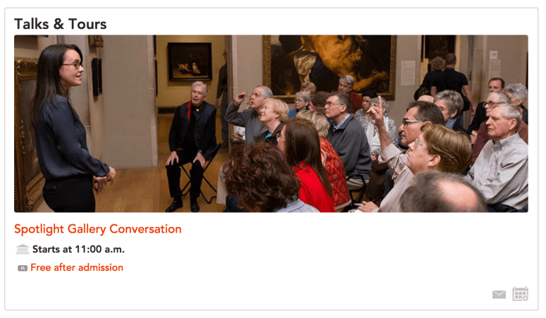
Even the images the museum uses to highlight its upcoming events are fairly homogenous when it comes to race:


Although museums with mission statements that include words like ’everyone’ and ‘for you’ might feel that they have addressed the issue of becoming more welcoming to those who do not normally feel that museums have been organized with them in mind, I feel that the current issue of inclusion in museums warrants a deeper dive into the effort to bring underserved audiences into the experience in a meaningful way, and that this effort must be addressed through the Philadelphia Museum of Art’s website just as it must be addressed through the websites of every other major cultural institution seeking to become truly inclusive.
Works Cited
Cameron, Fiona. “Digital Futures I: Museum Collections, Digital Technologies, and the Cultural Construction of Knowledge.” Curator: The Museum Journal, July 2003.
“Philadelphia Museum of Art.” Philadelphia Museum of Art. Philadelphia Museum of Art, 2016. Web. 18 Oct. 2016.
